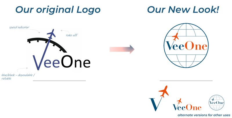
A lot of start-ups have humble origins – many of today’s biggest brands started in a basement or in someone’s garage! Similarly, our logo was dreamt up on a notepad, over a late-night meeting between our founders Johan and Martin, in preparation for an important investor meeting the following day. Intended to incorporate several elements of our DNA – the V1 moment of take-off, the speed of an aircraft, and the credibility of an expert partner, our founding logo served us well through our first year of operations.
As much as we loved the original identity, we knew it was time to build something new. We are smart enough to know that our skills are in Planning and Optimisation (and perhaps not in branding!) so we selected an expert partner who shared our values, and we went to work with the excellent Katinka Donagemma, together deciding on three core design principles:
🔄 The new look should remain faithful to the original logo and convey the impression of a natural progression rather than a drastic change. Evolution not revolution.
🫶🏼 It should show that we are reliable and trustworthy partners in a safety-critical industry, while also maintaining a friendly and approachable demeanor. We take our work seriously, but we always strive to do it with a positive attitude, a heart and a smile.
👩🏽✈️👨🏼✈️ We wanted to take inspiration for the logo from the “golden era of aviation,” which was portrayed in the movie “Catch Me If You Can.” We aimed to capture the classic style of airline logos from that time.
The finalised logo from Katinka is everything we hoped for and more. It has multiple versions, that you will see as our profile pic, in our presentations, email signatures and on our website (v2 launching soon … stay tuned!) We hope you love the new look as much as we do. Thank you for the partnership and collaboration Katinka, and for taking us through your process to achieve such a great outcome.